
ELSA History – How did the ELSA Logo come about?
An organisation needs a good logo, a symbol that identifies it.

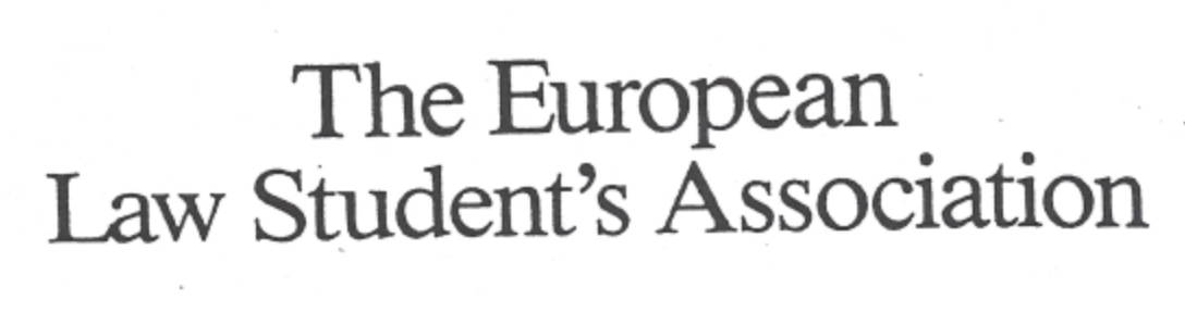
This was of paramount importance for ELSA in its early years, when the organisation was encumbered with a long and difficult name in three official languages:
The European Law Students’ Association – Europäische | Jurastudenten Vereinigung | L’Association Européenne des Etudiants en Droit.
The name had gone through initial growing pains: the original name adopted in 1981 was ‘European Law-Student Association’ which was quickly adapted into European Law Student Association before grammatical prudes in the membership demanded that a definite article and apostrophe and ‘s’ denoting genitive were something that a respectable organisation simply just could not survive without. As generations of ELSA activists can attest, interminable negotiations on the revisions to the statutes are a bane of the life of an aspiring international organisation.
The abbreviation ‘ELSA’ has remained unchanged from the very beginning. But the logo proved a more complicated matter: ELSA went through four logos in its first three years of operation.

The original 1981 logo with a blue, star-studded rectangle on a yellow background was quickly set aside because of its dangerous political overtones, in Communist Eastern Europe in particular. It was replaced in 1982 with a new simple logo that reproduced the entire name in Helvetica font – a neutral but hardly original or eye-catching solution:

At this time, the ELSA letterhead carried the names and addresses of all Board members at the bottom of the page. Perceived to add credibility, the list of names caused mainly confusion: a new letterhead had to be ordered and distributed every time when a new Board member was elected or an existing Board member moved to a new address.
The font was changed to Times New Roman in 1983:

When a revision of the Statutes added the definitive article, the apostrophe and the ‘s’ to the name, the logo had to break into two lines:
An inadvertent typo had crept into the letterhead, which was eventually corrected in other printed materials but the reprinting of the letterhead itself had to wait until such time when all the existing paper had been used up.
Already in 1983, the Board of ELSA started a project for designing a new logo to be used in printed materials and most importantly in new general brochures about ELSA. In pre-internet times, distributing printed brochures was the primary way of getting the message across to a wider audience. Sirkku Erholm (née Mäkelä), an active member of ELSA in Helsinki, persuaded her father Jukka Mäkelä, a well-known graphic designer, to prepare a few draft designs for a new logo:


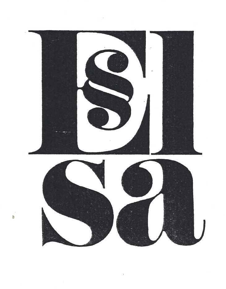

The International Board ultimately chose a logo comprising the lowercase letters e-l-§-a where the letter ‘s’ is replaced with paragraph sign § and the final letter ‘a’ is slightly smaller than the previous letters. The same logo remains still in use:

Since then, the only change has been the addition of the full name of the organisation, and the typeface has been changed from Times New Roman to EB Garamond.
In the early days of ELSA, different logos and letterheads were often used interchangeably and sometimes even cumulatively. This was largely due to a lack of financial resources: once a letterhead had been printed and paid for, they needed to get used, even if they carried the wrong logo. The original star-logo letterhead was still used in internal correspondence as late as 1985. Similarly, economies dictated colours used in printing. The 1983 Times New Roman letterhead was printed in bright red, as it was the cheapest alternative, whilst the next printing lot was in black on grey paper.
The ELSA Board did not fix the colour of the logo in 1985. The original design was in black on white background. Brochures in English, German and French were printed in brown on cream paper, which happened to be convenient for the donor of the printing work.
The current blue-on-white colours were fixed at the initiative of ELSA Netherlands. Royal Dutch Shell kindly sponsored the printing and distribution of new brochures and stationery in the new colours.
Increased resources led to increased professionality, and by 1990, the use of the logo had been established and uniform. In 2009, ELSA registered the logo as a trademark. Today, ELSA has detailed design guidelines about the use of the logo.
Eero Rautalahti
ELSA Alumni